Work / Brand and visual design / Kormaq
Kormaq Teleradiology
A new name and identity for a diagnostic platform that had outgrown its first one.

The brief
Kormaq started as KPN Teleradiology, reading scans remotely for hospitals that had no radiologist of their own. As it grew into imaging infrastructure and AI-assisted reporting, the old name described one service, not the company. I named the new one Kormaq.
The identity had to look credible to hospital management and clinicians, sit on a radiology report without getting in the way, and work in a pitch to investors. The guidelines also settle how the name is written, and keep the old name for historical or legal use only.
What I made
- NameKormaq, replacing KPN Teleradiology
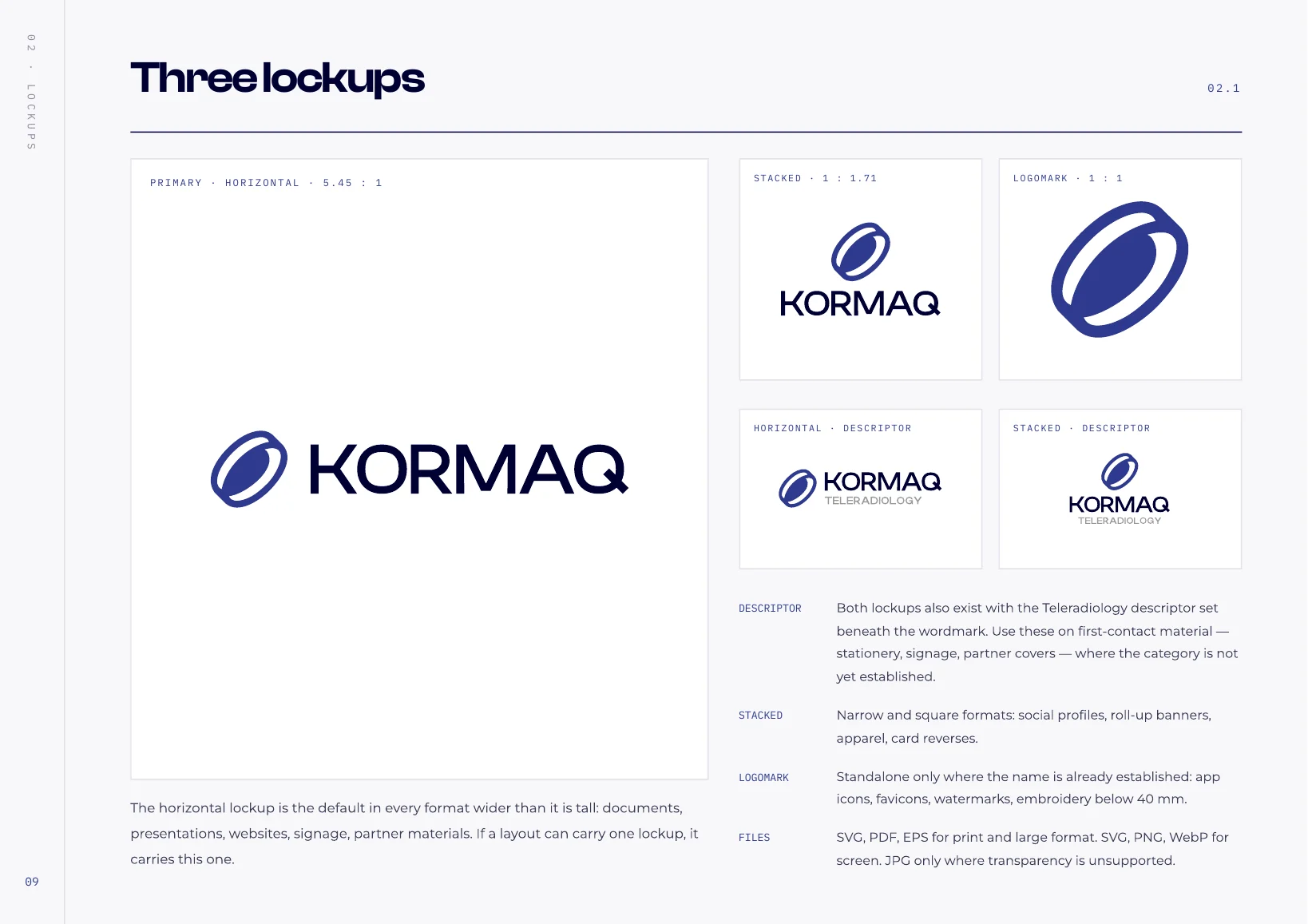
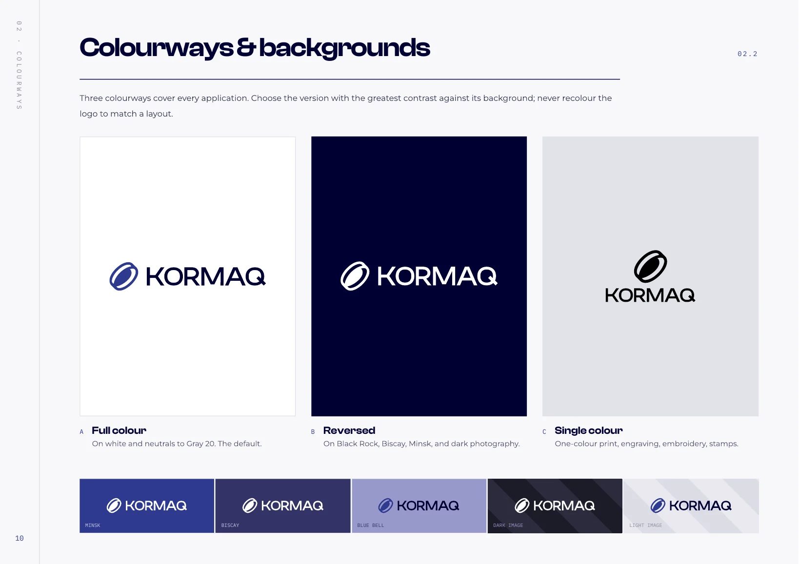
- Logo systemThree lockups and a logomark
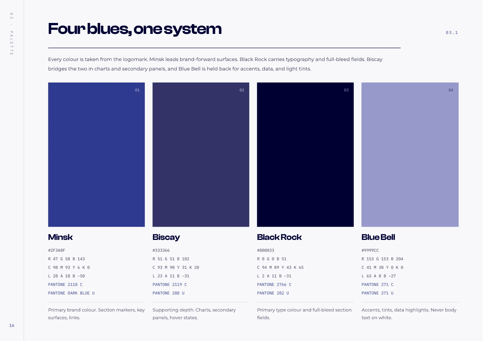
- ColourFour blues, six neutrals
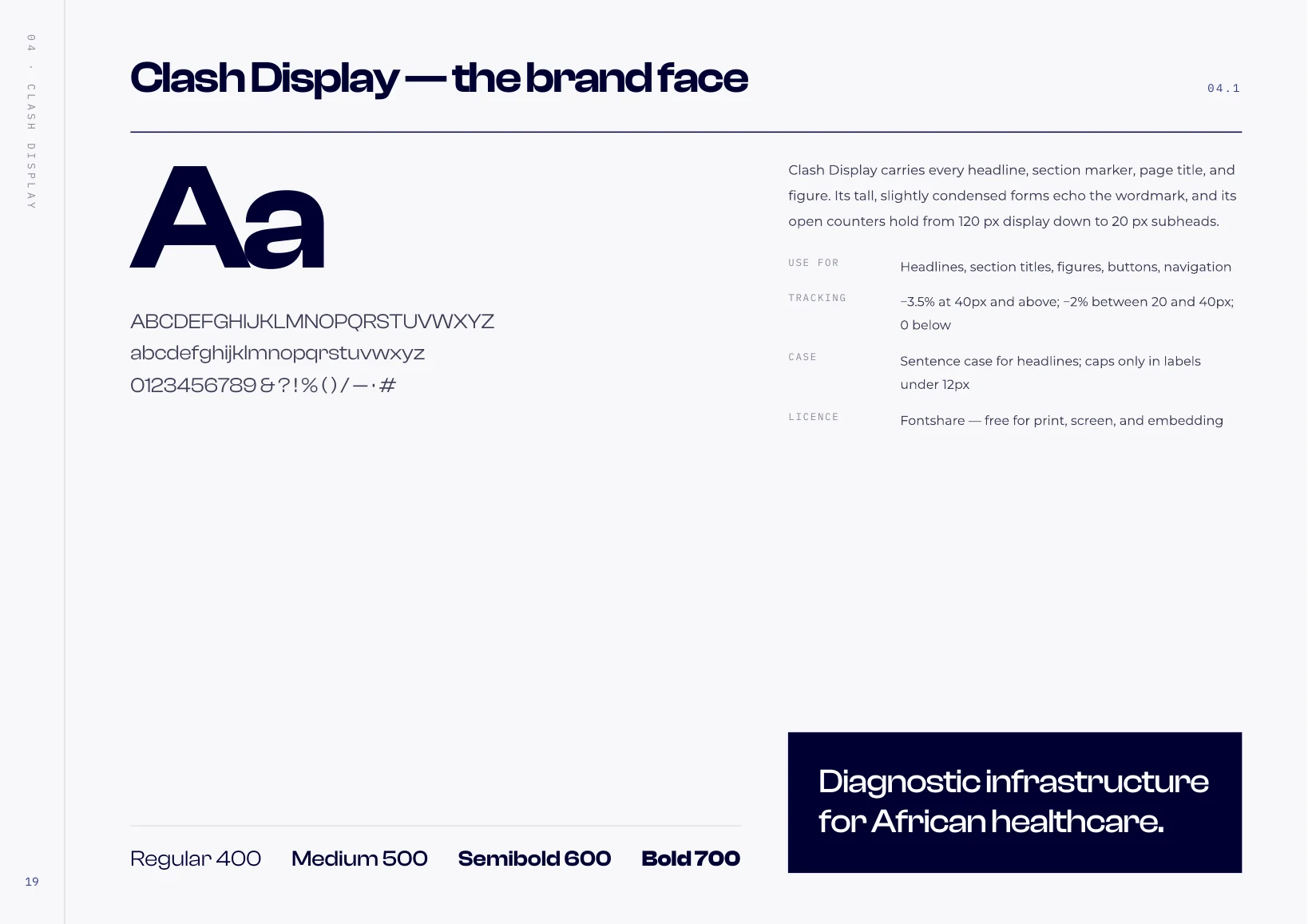
- TypographyClash Display, Montserrat, IBM Plex Mono
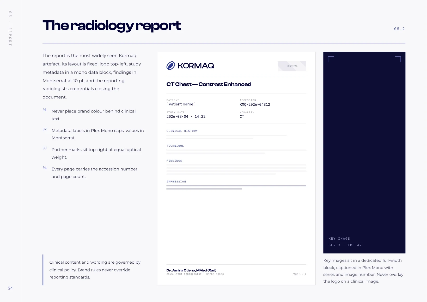
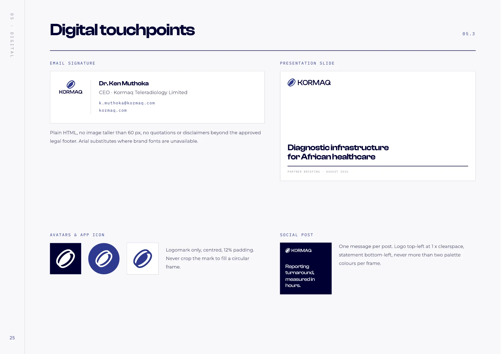
- ApplicationsStationery, report, digital, signage
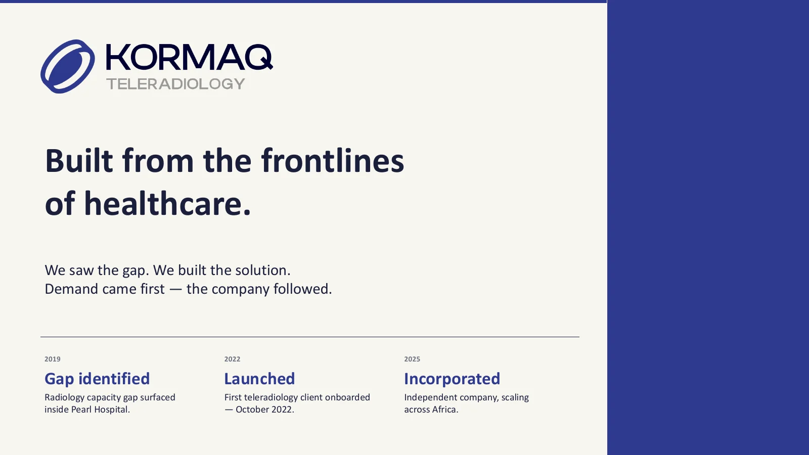
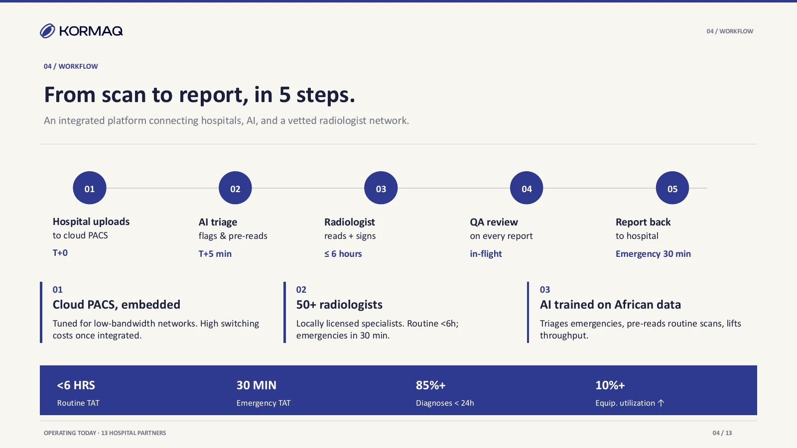
- Pitch deck13 slides

About the images
Kormaq approved the whole project for public use.
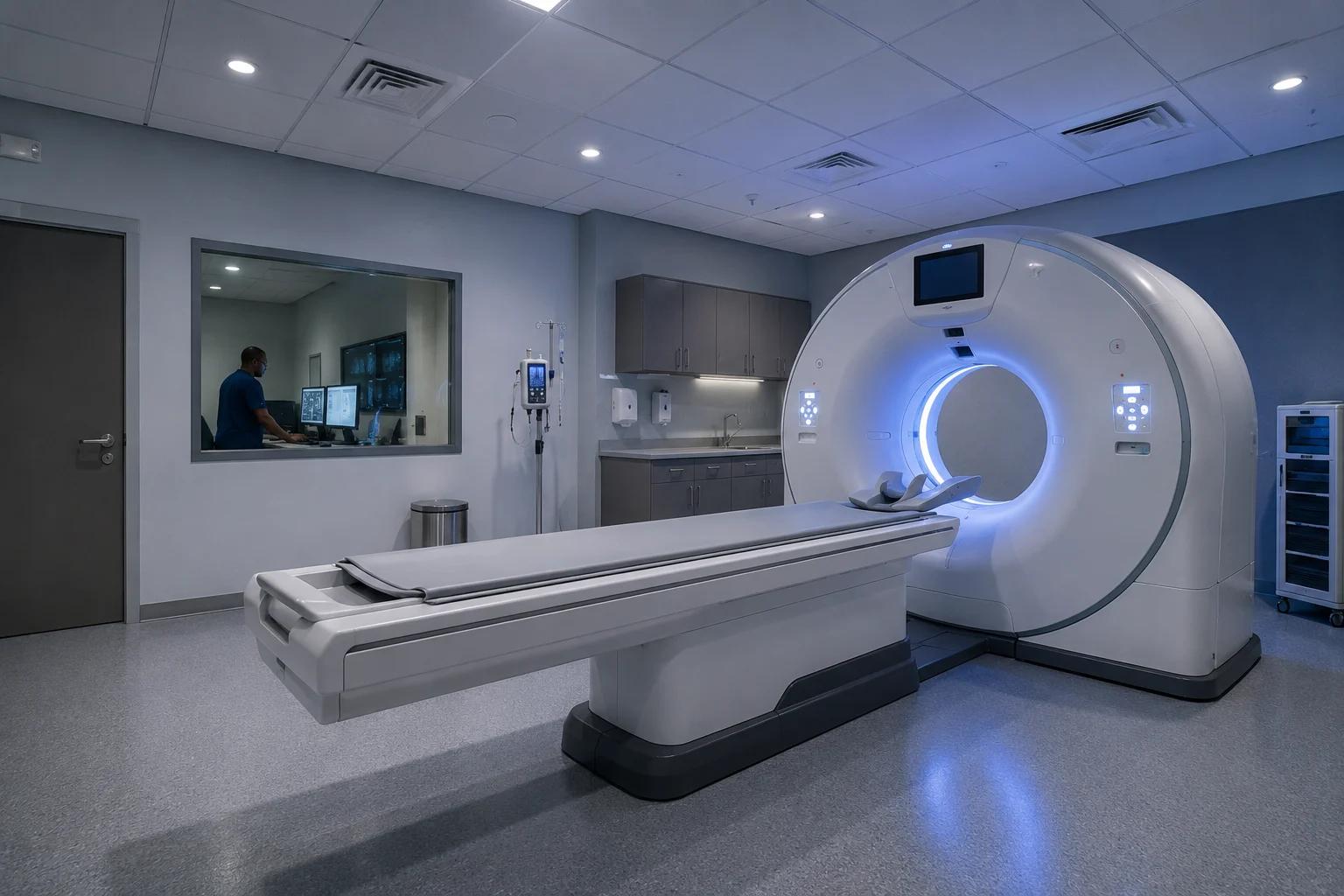
The people, rooms and equipment in the environment and photography images are AI-generated concept mockups, not photographs of Kormaq sites or staff.