Work / Brand and visual design / Deliverance Church

Deliverance Church International

A redrawn seal and a guideline for a church with many branches.
Client
Deliverance Church International
Role
Brand identity designer, freelance
Year
2020
Scope
Logo redesign, brand guidelines
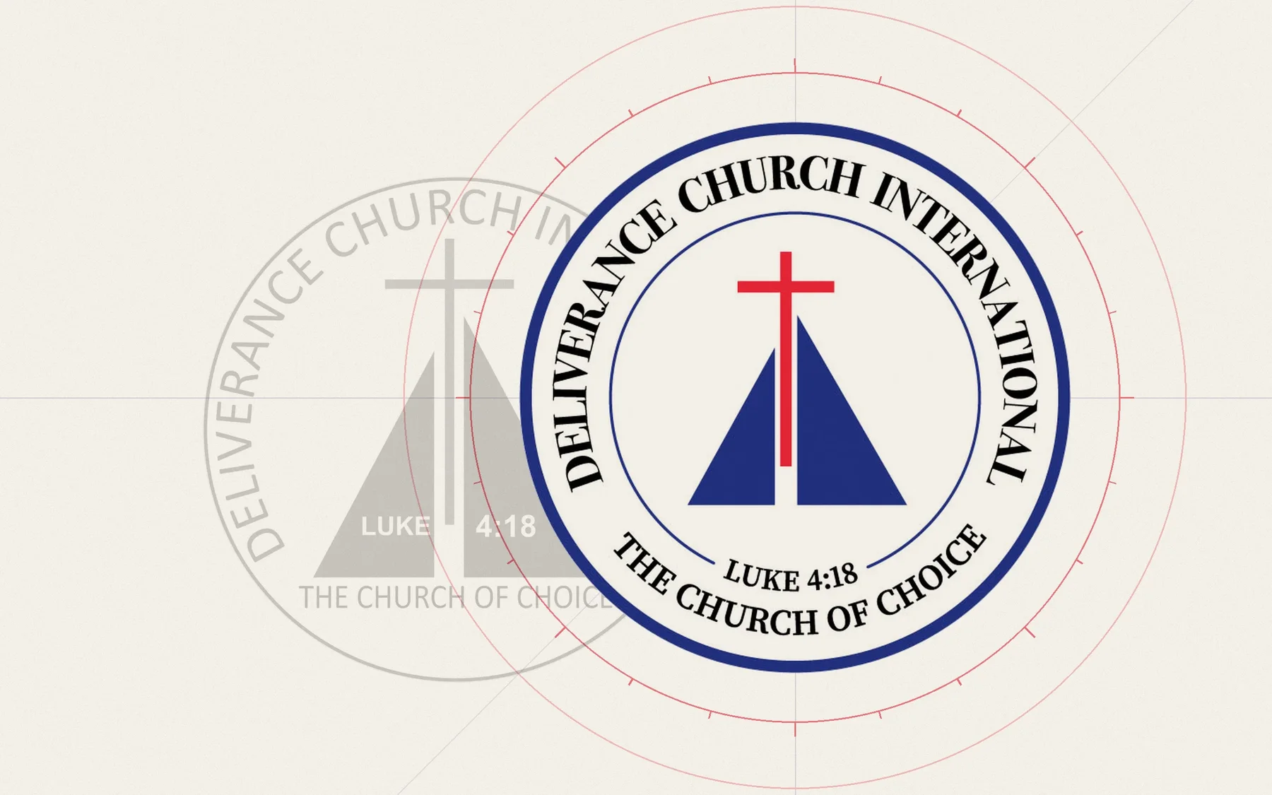
The redrawn Deliverance Church seal on paper, with the original seal in grey behind it and red drafting circles around it.
The original seal, traced and redrawn. The full brand guidelines run to 44 pages.

The brief

The church already had a seal: a blue triangle, a red cross, Luke 4:18 and the line The Church of Choice. It was familiar to the congregation, so the job was to redraw it, not replace it.

Branches needed their own lockup, the seal had to work in light, black and greyscale, and every branch needed one set of rules for print, apparel and social media.

What I made

  • Logo redesignSeal redrawn, same elements
  • Branch lockupSeal with branch name
  • TypographyBodoni 72, Source Serif Pro, Montserrat, Lato
  • ColourPrimary and accent palettes
  • ApplicationsStationery, apparel, social media
Download the brand guidelines PDF, 18 MB
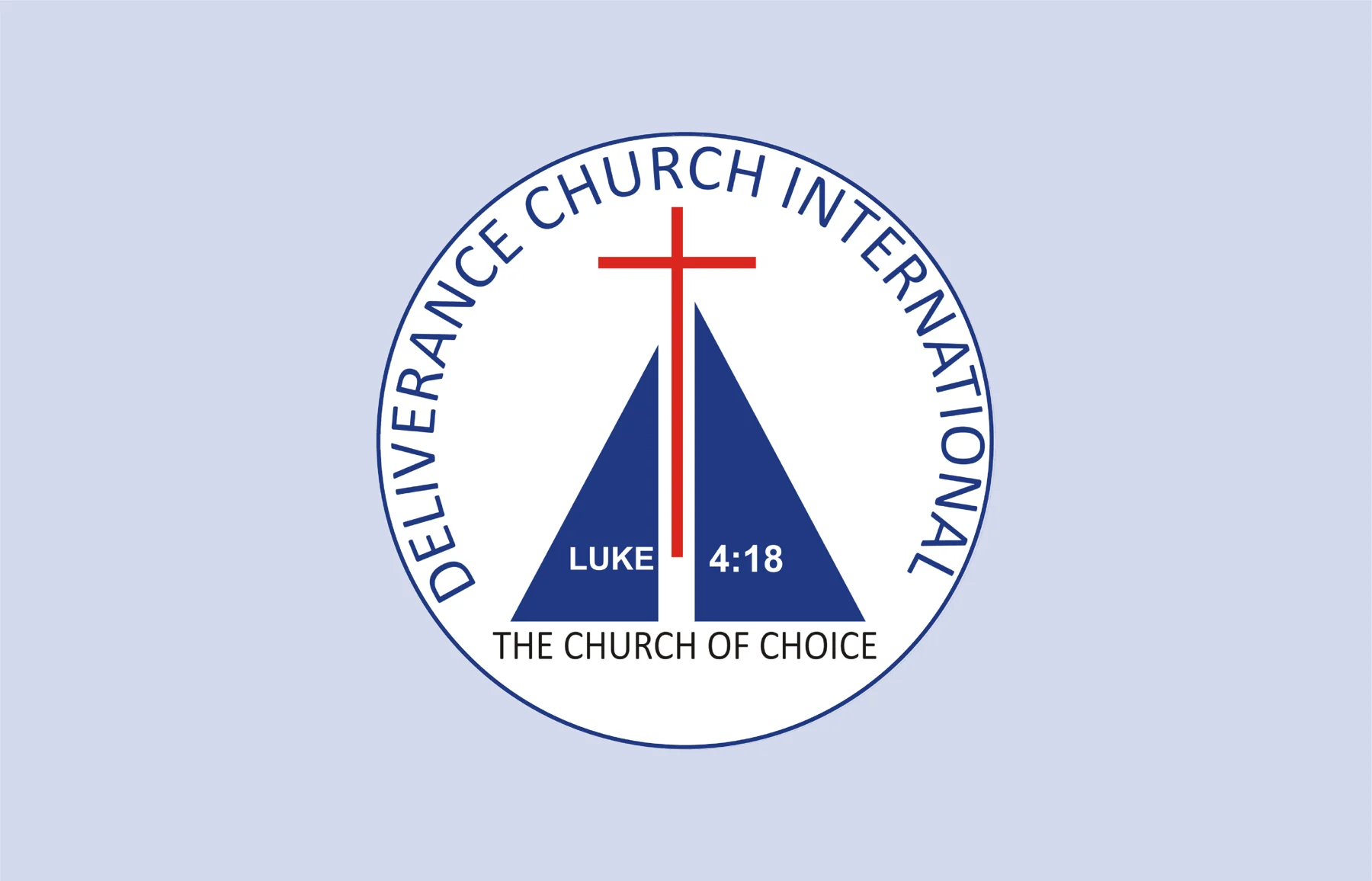
The original Deliverance Church seal.
Before: the original seal.
The redesigned seal with a heavier outer ring and serif lettering.
After: the same elements, redrawn with a stronger ring and serif lettering.
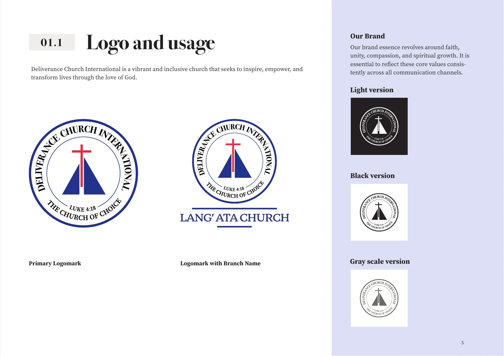
Logo and usage page: primary logomark, logomark with branch name, and light, black and greyscale versions.
The primary seal, a branch lockup and the single-colour versions.
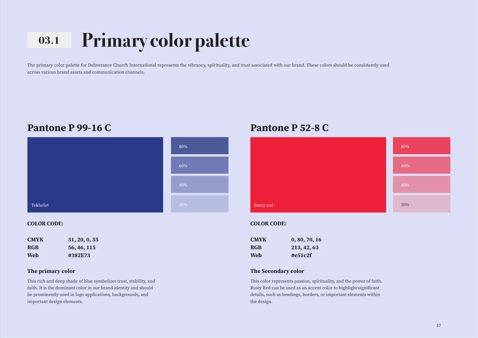
Primary colour palette page with the brand blue and red and their tints.
Primary colour palette.
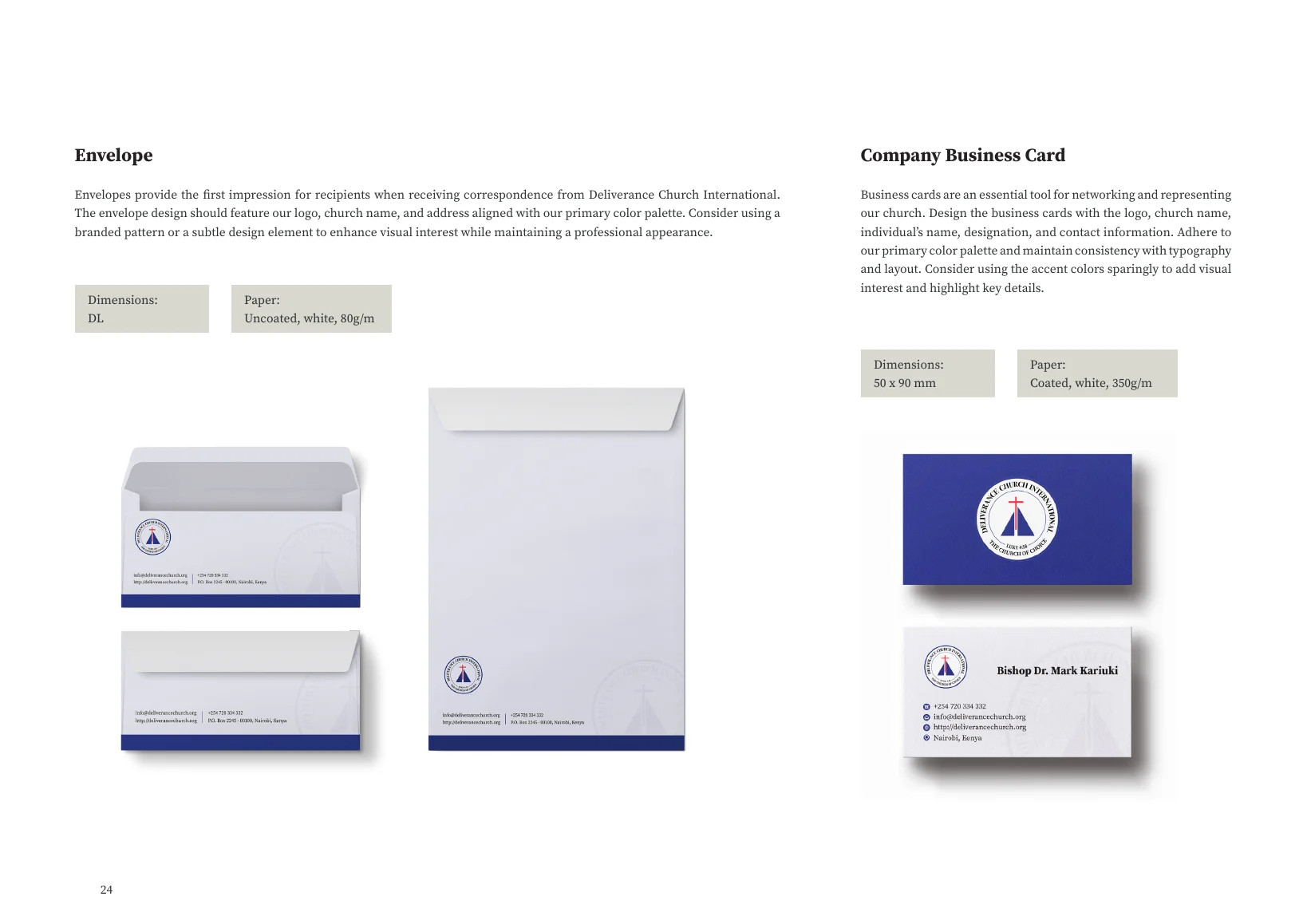
Stationery page with envelopes and business cards.
Envelopes and business cards.
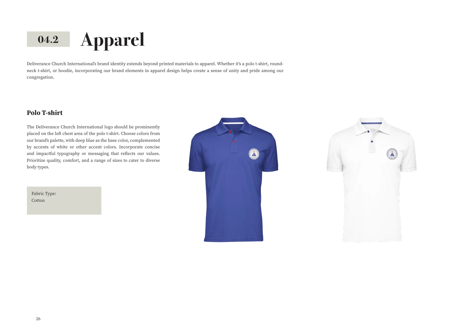
Apparel page with branded polo shirts.
Apparel.
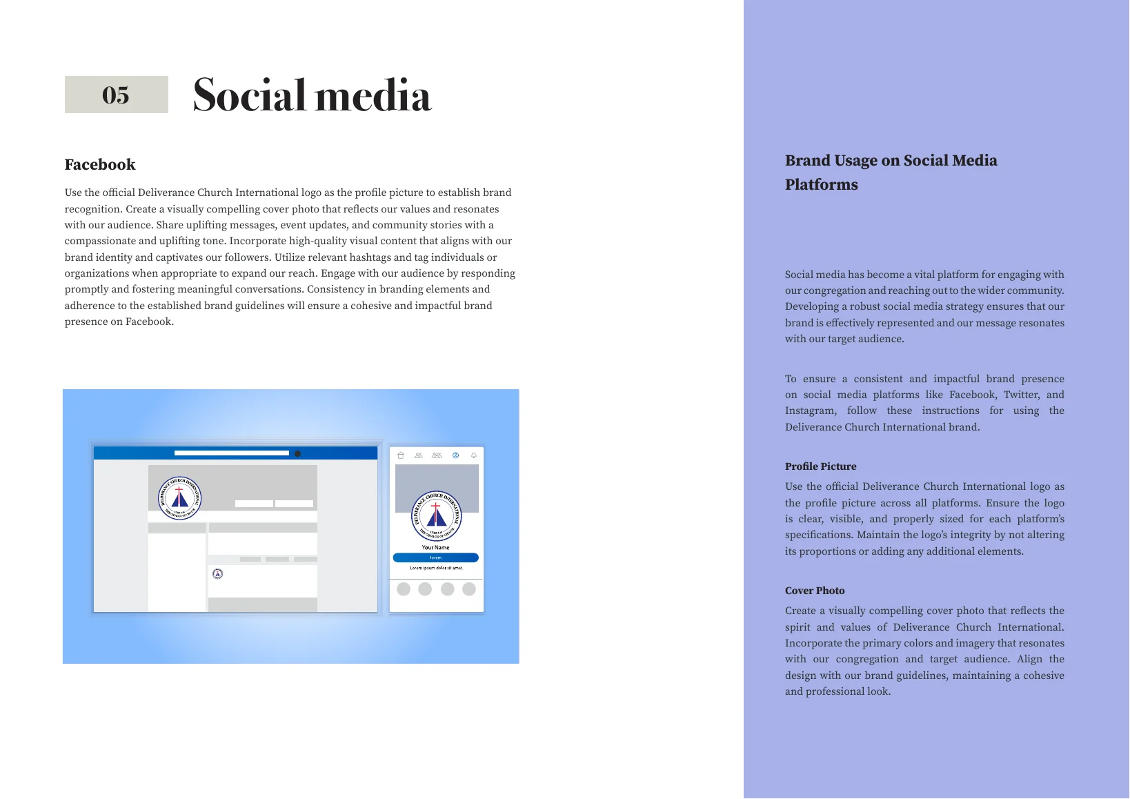
Social media page showing the seal as a Facebook profile picture and cover.
Social media.

About the images

The photographs of crosses, sunsets and congregations are stock images owned by Deliverance Church. They are shown here with the church's permission.

The seal, the branch lockup and the guideline layouts are my work.
Back to all work

Work

Five case studies and two brand projects.

The Kormaq mark repeated as a stack of receding slices in the four brand blues.