Mobile banking for Tanzanians, where the language choice comes first
Context
NMB is one of Tanzania's largest banks. Its customers were being handed what
customers across the region were being handed: a banking app shaped like a
Western product, with dense menus, English first, and flows that assumed you
already spoke the language of digital banking.
Swahili is the language most of those customers think in. Treating it as a layer
applied over an English original produces an interface that works properly for
the smaller group, and the seams show exactly where the vocabulary is hardest,
which is where money moves.
Starting position
The transactions people actually open a banking app for were buried. Sending
money, paying a merchant, checking what is left: each sat several levels down a
structure organised around the bank's product lines rather than around what a
customer came to do.
Research and usability testing were not established practice on either side of
the engagement. Decisions were settled by whoever held the most senior opinion
in the room.
Constraints
Decisions
01
Ask which language before asking anything else
Problem
An app that picks a language for you has already decided which customers it is really for. Putting the choice in settings means the people most likely to need it meet an English screen first.
Response
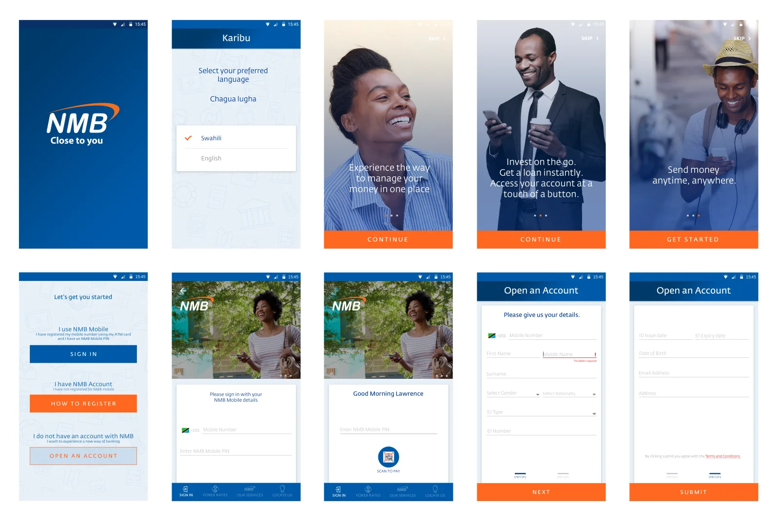
Language selection is the second screen, before sign-in and before any account exists. Swahili sits above English and is the default.
Traded away
A screen between the splash and the product, paid by every returning customer who already knows which language they want.
02
Design both languages as originals
Problem
Treating one language as the source and the other as its translation produces an interface that works properly for one group, and in Tanzania that is the smaller group.
Response
Both languages were designed as first-class, with switching available inside a flow, so a customer who met unfamiliar vocabulary mid-transaction could change language without abandoning what they were doing.
Traded away
Every string, screen and layout has to hold two languages of different lengths, and every feature added afterwards inherits that cost permanently.
03
Organise around what customers came to do
Problem
The structure mirrored the bank's product lines. Nobody opens an app thinking in product lines. They open it to send money to a specific person.
Response
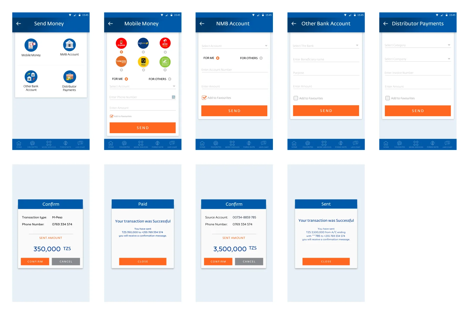
I flattened the hierarchy so the common transactions sat near the surface, and put the four ways of sending money on one screen rather than down a menu tree.
Traded away
A flat structure crowds the top level. The genuinely rare products got less room, and they still had to live somewhere.
04
Meet customers at three different starting points
Problem
Registration is where a first-time customer decides whether the thing is for them. The standard single entry either buries someone who has never banked digitally or wastes the time of someone who already has an account.
Response
The entry screen splits three ways: already using Mkononi, has an NMB account but not the app, and has no relationship with the bank at all. Each path only asks for what that customer can actually supply.
Traded away
Three paths to build, test and maintain where one would have shipped sooner.
05
Let the app remember what gets repeated
Problem
Most banking is repetition: the same people, the same bills. Re-entering an account number every time is the slowest path and the one where an expensive mistake is easiest.
Response
Add to Favourites sits inside the send flow rather than in a separate address book, so a destination is saved at the moment it is proven correct.
Traded away
Saved destinations are a security surface. Making repeat payment faster also makes a compromised session more dangerous, which is what forced the next decision.
06
Slow the flow down once, at the point money moves
Problem
Customers new to digital banking are being asked to trust an app with money. Security they cannot perceive reads as absent. Security in the middle of every action destroys the speed the rest of the design was for.
Response
Confirmation is a full screen restating source, destination and amount before anything is sent, and it is the only deliberate pause in the flow. Everywhere else the design gets out of the way.
Traded away
One more tap on every transfer, including the small repeat payments where the customer already knows exactly what they are doing.
Flow
Language is the first question the app asks, before sign-in and before
any account exists. Swahili sits above English and is selected by default.
Four destinations at one level rather than a menu tree. The confirm
screen is the only place the flow deliberately slows down.
Outcome
The app shipped as NMB Mkononi and is NMB's mobile banking product. I don't have adoption or usage data I can source, so I haven't included any.
Honest limits
This case study shows decisions and what they cost. It doesn't show that they worked.
I should be exact about what I did. I designed this at Eclectics International, a
software vendor that builds banking systems for African banks. I was not NMB
staff. I designed the interface and the information architecture and argued for
both, but I did not set the requirements, I did not control the roadmap, and the
engineering constraints I designed against were not mine to choose.
Research is the weakest part. There was no established testing practice on
either side, and I cannot show you research artefacts from this engagement,
because the arguments I won were won on design rationale rather than on evidence
I gathered. That is a real limit on what the work below proves.
Next
The question this project should be able to answer and cannot is whether anyone
used the language switch under pressure. It was the most expensive commitment in
the design and the first thing cut elsewhere as a nicety. Without that, decision
two is reasoning rather than proof.