Smallholder farming runs on three questions that have nothing to do with
farming technique: what is my crop worth this week, where do I sell it, and who
do I ask when something goes wrong.
Each is normally answered by a different source. A trader at the market, a
neighbour, a radio programme, an extension officer who visits occasionally.
The design gathers all three into one mobile app, alongside the weather
forecast that decides whether any of it matters this week. A marketing page for the web sits beside it. The app shipped. The marketing
page I can only show as a design.
A note on the name, because it will not match what you see. The study is filed
as eFarm. The design brands itself efarmi on its splash screen and in its
home header, the marketing page brands itself Kristalogic, and the six
editions on Google Play each carry a local name of their own.
Starting position
The work covers five things that each want to be a product: produce listings,
market price data, weather, agronomy reference material and a community forum.
The risk in a scope like that is a launcher screen with five icons and no
opinion about which of them matters.
There is a second problem underneath it. The farmers this is drawn for are not,
in any settled sense, app users yet. An app that opens on a registration form
has asked for trust before it has given a reason for any.
Constraints
Decisions
Offer a way in that does not ask who you are
The problem
Everything here is a reason to come back, and none of it earns that if the first screen is a form. The people least likely to already have an account are the ones the product exists for.
What I did
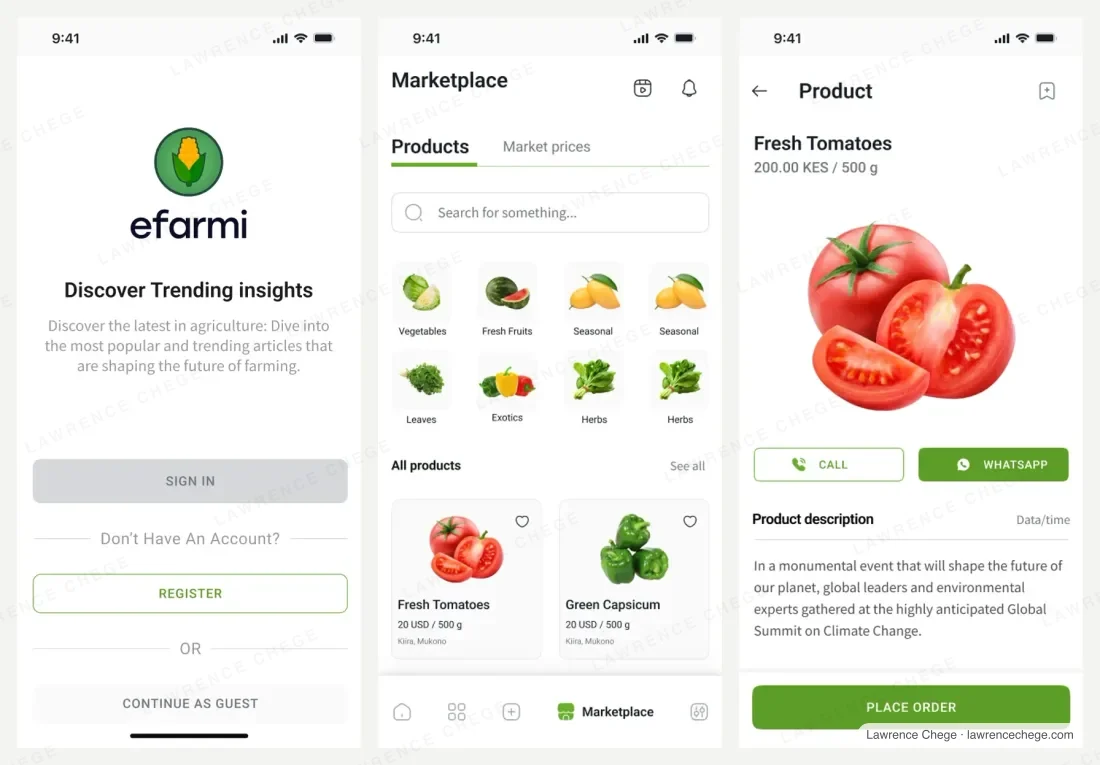
The entry screen offers Continue as guest beside Sign in and Register, rather than putting registration in the way of a first look.
Traded away
A guest session carries no identity, so anything built on knowing the user has to be designed as an upgrade rather than assumed, and the moment that does ask for an account arrives later and has to work harder.
Hand the conversation to a channel people already use
The problem
A marketplace invites you to build messaging, then reputation, then dispute handling. Each is a product in itself, and an empty inbox is worse than none: a buyer who sends a message into silence does not come back.
What I did
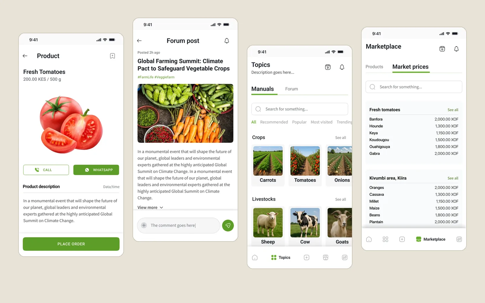
A product page ends in Call and WhatsApp buttons beside Place order, so a buyer reaches the seller on a channel already open on their phone rather than in an inbox built for this app.
Traded away
The transaction leaves the product. The app cannot see whether the deal happened, cannot keep a record of it, and cannot build reputation out of it. That is a real cost, taken deliberately.
Separate what to buy from what to sell for
The problem
Produce listings and market prices look like one thing and are not. One is shopping. The other is deciding whether to harvest this week or next, and it is read by someone with nothing to buy.
What I did
Marketplace carries two tabs at the same level, Products and Market prices. The price board is organised both ways: one crop across named markets (Banfora, Houndé, Keya, Koudougou, Ouahigouya, Gabra), and one area across its crops.
Traded away
Two tabs on one screen means neither gets the whole surface, and the price board, arguably the thing opened most often, sits a tap behind a label rather than on the home screen.
Keep expert guidance and peer opinion visibly apart
The problem
Agronomy advice and community conversation carry different weight. Blended into one feed, a confident wrong answer sits level with the extension material and the reader cannot tell which is which.
What I did
Topics splits into Manuals and Forum as sibling tabs. Manuals are organised by the thing in front of the farmer, Crops then Livestock, as named entries: Carrots, Tomatoes, Onions, Sheep, Cow, Goats. Forum posts carry a poster and a comment thread.
Traded away
Two places to look for one answer, and a question already settled in the manuals will still get asked in the forum.
Give weather the room its consequences deserve
The problem
Weather is usually a widget. For this reader it decides planting, spraying and harvest, and an icon with a temperature answers none of those.
What I did
Weather sits on the home screen and opens into a full view: the current reading, an hourly strip, and a named seven-day outlook, so a decision about the week can be made from one screen.
Traded away
A forecast given this much prominence is trusted to that degree, and forecast accuracy is not something the design controls.
Flow
The path from a first look to a seller. Guest access at the front,
then browsing, then a product page whose last actions hand the conversation
to a channel the buyer already has, rather than to an inbox built here.
Outcome
The app shipped. The six live editions are in the Shipped band at the top of
this page, each linked to its Google Play listing, so you can open them
yourself.
There are no adoption or usage figures here. None were shared with me that I
can point to.
Honest limits
This study shows a design and the reasoning under it, not that the design
worked, and here that gap is wider than on anything else on this site. I
designed the interface; I did not run field research and cannot show you a
usability session with the people this was drawn for, so the constraints above
are arguments from the users' situation rather than findings from watching
them.
The boards are populated with placeholder content, so the crops, figures and
places on them demonstrate structure rather than real data. The clearest sign
is in the Flow image above: the marketplace grid prices Fresh Tomatoes at 20
USD per 500g, and the product page for that same item prices it at 200.00 KES.
The price board is a separate case, uniformly in XOF but listing Burkinabè
markets beside an East African area. None of it is a market report.
Next
The question worth answering first is whether decision one works, and where
guests convert. Guest access costs real capability everywhere downstream, and
the whole argument for paying that is that people who would have bounced off a
registration form stay long enough to find a reason to register. Six live
editions now make that measurable.